

Table of Contents
Understanding the Importance of Mobile Optimization for Project Galleries
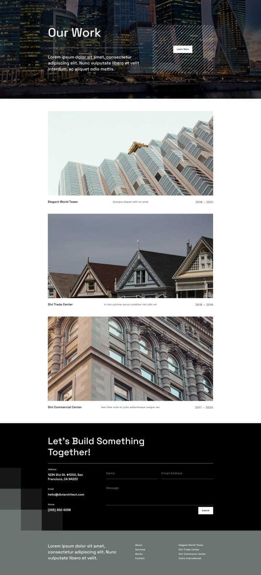
As an architect in Melbourne or beyond, your online project gallery serves as your digital portfolio, showcasing stunning designs and past works to potential clients. With over 60% of web traffic coming from mobile devices, a flawless mobile experience is non-negotiable. A poorly optimized gallery can lead to high bounce rates, lost leads, and diminished credibility. At PKRank, a leading digital marketing firm based in Melbourne, we specialize in helping architects like you create responsive, engaging websites that convert visitors into clients. This article guides you through essential steps to ensure your project gallery shines on smartphones and tablets, enhancing user engagement and boosting your business growth.
Assess Your Current Mobile Performance
Before diving into optimizations, evaluate how your gallery performs on mobile. Start by using free tools like Google’s Mobile-Friendly Test or PageSpeed Insights. These analyze loading speeds, viewport settings, and usability issues. Enter your gallery URL and review the report for critical errors such as text too small to read or content wider than the screen. Transitioning from assessment to action requires identifying pain points early. For instance, if images load slowly, this signals a need for compression. Regularly auditing your site ensures ongoing improvements, keeping your gallery competitive in the architectural market.
Implement Responsive Design Fundamentals
Responsive design is the cornerstone of mobile perfection. Use CSS media queries to adapt layouts based on screen size. Ensure your gallery grid reflows seamlessly—from a multi-column desktop view to a single-column mobile stack. Frameworks like Bootstrap or Tailwind CSS simplify this process with built-in responsive classes. Pay attention to touch targets; buttons and swipe gestures should be at least 44×44 pixels for comfortable interaction. As you refine these elements, your gallery becomes intuitive, allowing users to swipe through projects effortlessly. This foundational step paves the way for faster load times and superior visuals.
Optimize Images and Media for Speed and Quality
High-resolution project photos are vital for architects, but unoptimized images can cripple mobile performance. Compress files without sacrificing quality using tools like TinyPNG or ImageOptim. Convert to modern formats such as WebP, which offer smaller file sizes than JPEG or PNG. Implement lazy loading to defer off-screen images until needed, reducing initial page weight. Additionally, set explicit width and height attributes to prevent layout shifts. Here’s a step-by-step guide to flawless image optimization:
- Select high-quality source images and resize them to match display needs—never upload full-resolution files.
- Compress aggressively: aim for under 100KB per hero image.
- Use responsive images with srcset attributes for device-specific delivery.
- Test alt text for accessibility, describing each project succinctly.
- Minimize sliders; opt for static grids with lightbox popups.
Following these practices dramatically improves Core Web Vitals, signaling search engines your site merits higher rankings.
Test Across Devices and Browsers
Emulation tools like Chrome DevTools are helpful, but real-device testing reveals true usability. Borrow various smartphones or use services like BrowserStack for comprehensive coverage. Check for rendering issues, scrolling smoothness, and gesture responsiveness. A structured testing table helps track results systematically:
| Device | Screen Resolution | Key Metrics | Issues Found | Resolution Status |
|---|---|---|---|---|
| iPhone 14 | 390×844 | Load time: 2.5s | Image overflow | Fixed |
| Samsung Galaxy S23 | 360×800 | Load time: 1.8s | Slow carousel | Pending |
| iPad Air | 820×1180 | Load time: 3.2s | Touch targets small | Fixed |
| Pixel 7 | 393×851 | Load time: 2.1s | No issues | N/A |
Use this table as a template in your workflow. Iterative testing bridges the gap between design intent and user reality, ensuring consistency across ecosystems.
Enhance Navigation and User Experience
Mobile users expect frictionless navigation. Incorporate a sticky navigation bar with a prominent gallery menu. Use hamburger menus judiciously, prioritizing key projects on the fold. Add swipe gestures for gallery browsing and pinch-to-zoom for detailed views. Integrate progressive enhancement, where basic content loads first, followed by enhancements. Analytics tools like Google Analytics track mobile-specific behaviors, informing further tweaks. By focusing on UX, you guide visitors deeper into your portfolio, increasing inquiry rates.
Leverage Performance Tools and Professional Help
Advanced tools like Lighthouse audits provide actionable scores for performance, accessibility, and SEO. Automate optimizations with plugins such as Smush for WordPress or Cloudinary for dynamic delivery. For Melbourne architects seeking expertise, partner with specialists like PKRank. Our team audits, redesigns, and maintains mobile-first galleries tailored to the industry. We integrate schema markup for rich snippets, elevating your projects in search results. This collaboration saves time, ensuring your online presence remains cutting-edge.
Conclusion
A flawless mobile project gallery transforms casual browsers into loyal clients, positioning your architectural firm as innovative and accessible. By assessing performance, embracing responsive principles, optimizing assets, rigorous testing, and seeking expert support, you achieve technical excellence. Implement these strategies today, and watch your digital footprint expand. Contact PKRank in Melbourne to elevate your gallery—we’re here to rank you higher and drive results.
Empower Your Architectural Firm with PKRank’s Tailored Digital Solutions
Hey there, design visionary! Dreaming up stunning structures in Australia’s sun-soaked landscapes can be pure magic, but getting your blueprints in front of the right clients? That’s where the real blueprint comes in.
At PKRank, we’re all about keeping digital marketing breezy, approachable, and incredibly impactful for architects like you—whether you’re sketching sustainable homes in Sydney’s harbor views, innovating high-rises in Melbourne’s laneway charm, or crafting coastal gems in Brisbane’s riverside vibe.
Imagine a polished, immersive website built from the ground up for you, featuring interactive portfolios of your residential wonders, commercial masterpieces, or eco-friendly designs with seamless galleries and 3D viewer integrations. We’ll ensure it’s mobile-responsive, so builders and homeowners from Perth’s urban sprawl to Adelaide’s heritage sites can explore your vision effortlessly on the go.
How to Ensure My Online Project Gallery Is Flawless on Mobile Devices?
Our SEO pros will elevate your Google presence, landing you top spots for queries like “sustainable architect Melbourne” or “renovation specialist Perth.” No more fading into the background—unlock organic traffic from Canberra’s modernist buffs or the Gold Coast’s beachfront dreamers!
We’ll jazz up your social media with a creative flair on Instagram and Facebook: eye-catching renders, behind-the-scenes builds, and tips on green architecture that ignite shares and connections. It’s your chance to shine as the go-to creative force in spots like Hobart’s historic enclaves or Darwin’s tropical outposts.
Need swift project leads? Our Google Ads and Facebook Ads are architect-tuned, pinpointing Aussie developers and homeowners with clever, cost-effective campaigns that boost consultations and trim the chase—ideal for architecture hotspots in Sydney and Melbourne.
We’re your upbeat collaborators in elevation, focused on results that let you pour passion into every line and curve. Keen for a laid-back brainstorm over virtual flat whites? Head to our website—let’s blueprint your firm’s stellar rise together!